

Our job is not to take the place of the creatives who imagine and design these layouts, but rather to recognize the creative intent that has met the customer's needs and make it as relevant as possible, whatever the target market. For us, content is visual and graphic material, that conveys a message in its form, always in line with our client's brand image.
The Visual Experience of Words
If graphic adaptation had to be summed up in a few words, they would probably be these: while our language managers are busy producing texts that are as natural as possible for a native speaker, our graphic designers are dedicated to conveying the customer's message beyond the words, from the very first glance at the publication.
"We focus on the story to be told, the connotation induced by the graphic creation that we receive for adaptation. Our client's artistic direction never misses its target: the moment the reader lays their eyes on the page, before even having read a single word, a message is passed on. We need to make sure that this implicit message doesn't disappear, get distorted, or flattened by misguided typo choices."
Desktop Publishing (DTP) Co-manager, Acolad
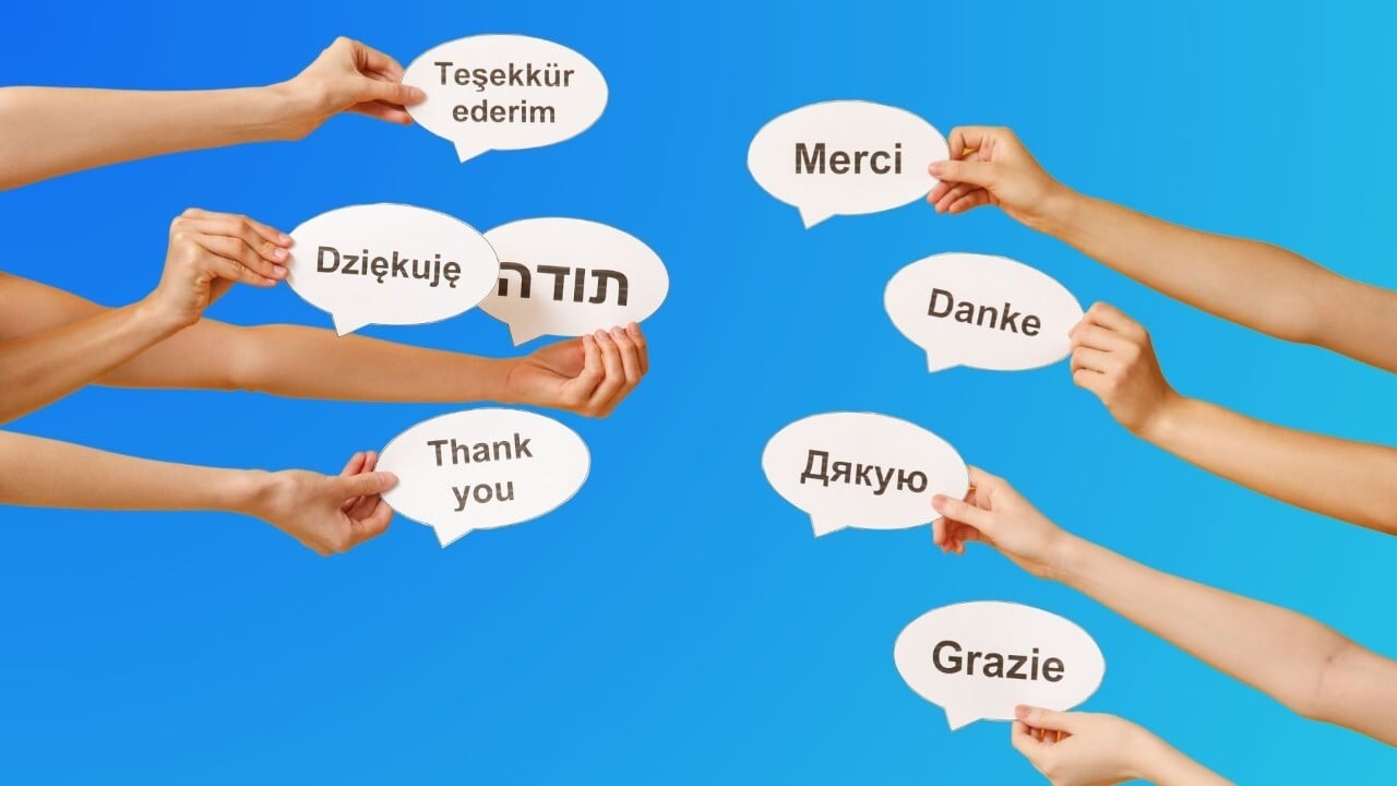
Some languages can be tricky, especially translations into Asian languages and Arabic. Rather than creating a "bizarre" adaptation of the source text with no real meaning, it's sometimes better to keep things simple. In the luxury sector, the Arabic or Chinese reader may look favorably on untranslated graphic elements: it will be perceived as a "made in France" signature.
From a more "microtypographic" point of view, for European languages, it's in the "fine-tuning" of the text that a good adaptation is made. When translating into German, for example, we'll make hyphenation compulsory for justified running text, as this language is fond of long words, and these words support hyphenation very well. The German reader is used to these settings and doesn't notice them: reading remains fluid regardless of the number of hyphenations. This is also why we work hand-in-hand with our language managers to fine-tune these graphic adaptations.
Our ambition is to create our own typographic codes for our main working languages, thus linking the constraints of language, content and container.