Buttons
All Buttons
Buttons and usage should be consistent across all digital touchpoints. Blue or White variations should be chosen based on highest level of contrast to the background. Primary and secondary buttons should have 4px rounded corners - they should not be squared, not fully rounded.
Primary CTA Button
The Solid Blue button is our primary CTA on all backgrounds while the solid white can also be used on dark backgrounds if that increases contrast in the layout. The text should be in Title Caps per APA standards.
Secondary & Tertiary buttons
As the name suggests, these should only be used in as lesser alternatives to the primary button.
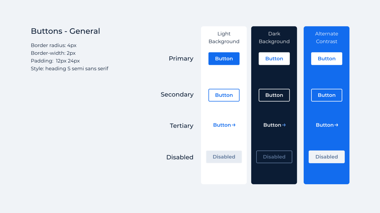
Button Combinations
To ensure a clear informational hierarchy and optimal user experience, it's essential to avoid having multiple primary CTAs competing within the same layout. If two CTAs are necessary, we recommend using a combination of Primary + Secondary or Primary + Tertiary depending on your specific needs.

Hyperlinked Text
These are linked rich text areas commonly used within the paragraph body text. They can also be used in scenarios when a button may not be ideal.
On light Background: The link should be underlined and Blue Ribbon (#126cee)
On dark background: The link should be underlined and White (#ffffff)
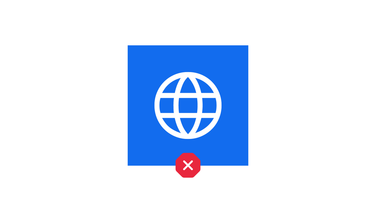
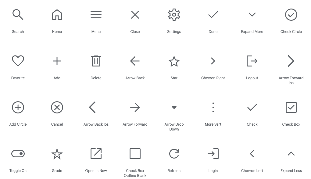
Icons
All icons used in our branded assets should be pulled from the Google Material Symbols library. Use this open source to search through 2,500 glyphs.
Settings: Rounded, no fill, weight: 400, grade: 0, optical size: 48px
Gradients
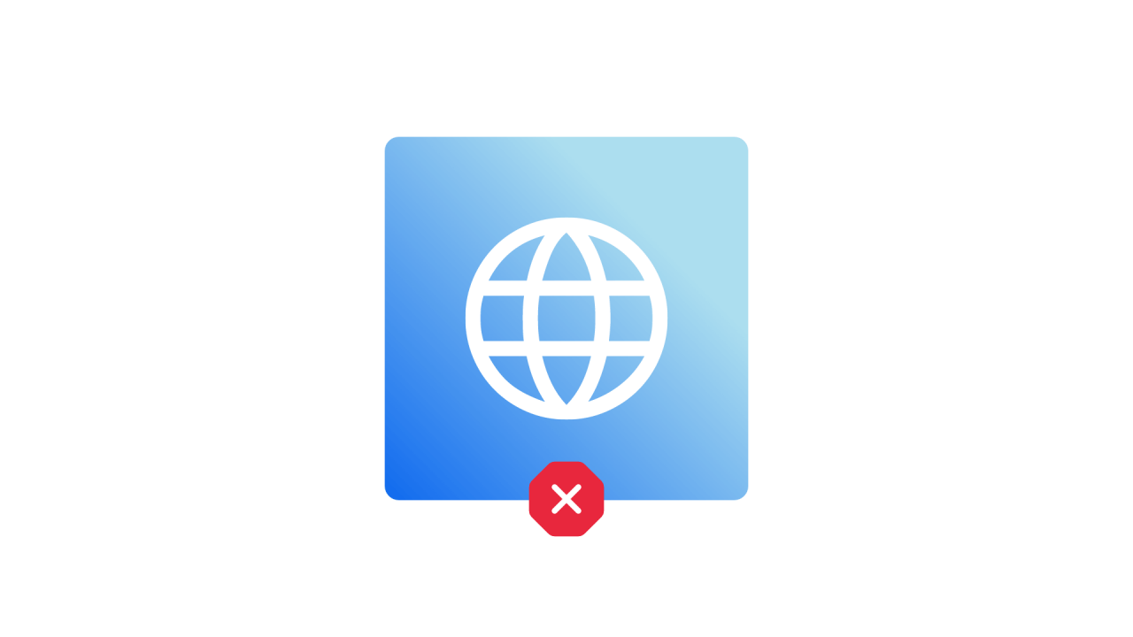
There are 3 types of gradients in use: Zodiac, Blue Ribbon, and White. The gradient can flow in any direction, though it's most typically used from left to right. Be sure to allow optimal contrast for legibility when using text on top of your gradient.


Object Styling
Use flat colored shaped with no gradient effects beyond what is defined for image overlays

Do not apply bevel edges, reflections or other skeuomorphic effects to your shapes

Do not apply a drop shadow to your objects unless it serves a function that benefits a user.

Do round corners on your shapes and image frames
- Small shapes: 4px corner radius
- Medium shapes: 8px corner radius
- Large shapes: 20px corner radius
- X-Large shapes: 40px corner radius