
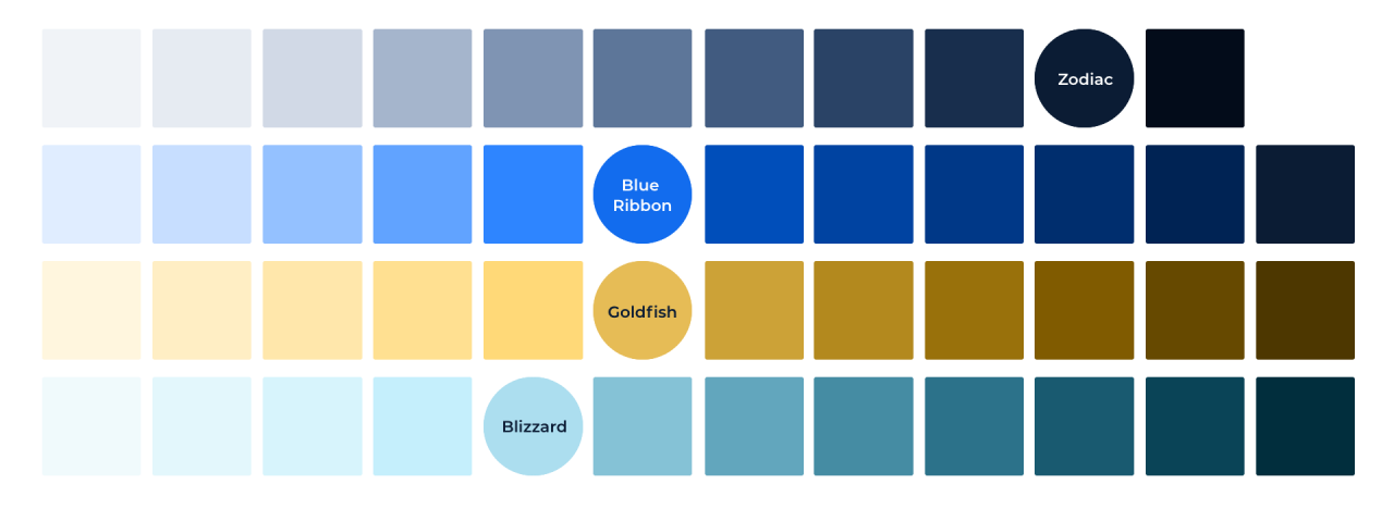
Primary Color Palette
Our primary color palette includes Black, Blue, and White. It's important to use these colors consistently to reinforce brand recognition and ensure they are the dominant colors in most scenarios. Their purpose is to direct the eye and highlight essential information, creating a visually cohesive experience. We recommend applying colors thoughtfully to establish a visual hierarchy that guides the user's attention towards the most important elements.


Extended Color Palette
In some cases, we don't use our branded fonts and instead use native typography to improve performance and accessibility. This is typically the case for emails, spreadsheets, and text documents that fall outside of the Marketing scope.


Neutrals
Colors from our neutral palette are most often used as UI elements, backgrounds, and text.


Tints
Using Color
While there are many color options available, it's essential to use them thoughtfully and consistently. This not only ensures our visual message is clear and memorable, but also promotes accessibility for all users. To achieve cohesion, we primarily use our designated colors in combination with an accent. We also limit the number of colors used in each layout, following an approximate 60:30:10 ratio to create a balanced and visually appealing design. By following our color guidelines, we can create a powerful brand image that resonates with our audience.
The most common two scenarios are:
- 60% White background: 30% Zodiac Black text : 10% Blue Ribbon accent
- 60% Zodiac Black background: 30% White text : 10% Blue Ribbon accent
Creating a color balance in your layout
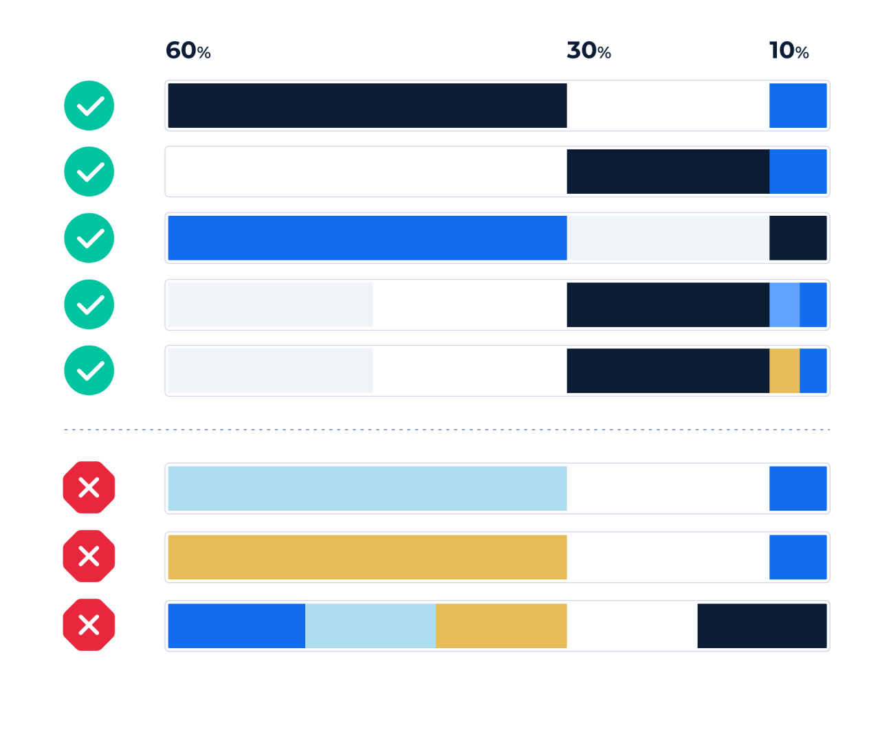
For instance, white and a light grey tint can be grouped as "light" colors. In the same way, Zodiac Black and a similar tint can be grouped as "dark." The accent, which is the 10% column, can be used to draw extra attention to that color area. This concept is applied to primary buttons and could also be used to add a decorative touch for a more pleasing aesthetic.
Using too many colors in our layouts can create visual clutter and make it difficult for viewers to understand the hierarchy of information we are trying to convey. Therefore, we aim to use a limited color palette in a thoughtful and intentional manner to ensure a cohesive and effective visual design.
Examples using the 60:30:10 rule
Color serves more than aesthetics and brand consistency; it establishes a visual hierarchy in your design. Using the 60:30:10 ratio, emphasize key elements with the accent color to attract users' attention effectively.


Do not use too many colors at once
Using too many colors at once is not only breaking from the 60:30:10 brand rule, but your content actually becomes harder to digest. Overuse of color can create undesirable distractions as the items start competing for attention.